Text Fields
Text fields let users enter and edit text.
Text fields allow users to enter text into a UI. They typically appear in forms and dialogs.
TextField
The TextField wrapper component is a complete form control including a label, input and help text.
Note: This version of the text field is no longer documented in the Material Design documentation.
Outlined
TextField supports outlined styling.
Components
TextField is composed of smaller components (
FormControl,
Input,
FilledInput,
InputLabel,
OutlinedInput,
and FormHelperText
) that you can leverage directly to significantly customize your form inputs.
You might also have noticed that some native HTML input properties are missing from the TextField component.
This is on purpose.
The component takes care of the most used properties, then it's up to the user to use the underlying component shown in the following demo. Still, you can use inputProps (and InputProps, InputLabelProps properties) if you want to avoid some boilerplate.
Customized inputs
If you have been reading the overrides documentation page but you are not confident jumping in, here's an example of how you can change the main color of an Input.
⚠️ While the material design specification encourages theming, these examples are off the beaten path.
Customization does not stop at CSS, you can use composition to build custom components and give your app a unique feel.
Below is an example using the InputBase component, inspired by Google Maps.
Input Adornments
Input allows the provision of InputAdornment.
These can be used to add a prefix, a suffix or an action to an input.
For instance, you can use an icon button to hide or reveal the password.
Layout
TextField, FormControl allow the specification of margin to alter the vertical spacing of inputs. Using
none (default) will not apply margins to the FormControl, whereas dense and normal will as well as alter
other styles to meet the specification.
Limitations
The input label "shrink" state isn't always correct. The input label is supposed to shrink as soon as the input is displaying something. In some circumstances, we can't determine the "shrink" state (number input, datetime input, Stripe input). You might notice an overlap.
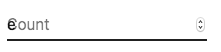
To workaround the issue, you can force the "shrink" state of the label.
<TextField InputLabelProps={{ shrink: true }} />or
<InputLabel shrink>Count</InputLabel>Formatted inputs
You can use third-party libraries to format an input.
You have to provide a custom implementation of the <input> element with the inputComponent property.
The provided input component should handle the inputRef property.
The property should be called with a value implementing the HTMLInputElement interface.
The following demo uses the react-text-mask and react-number-format libraries.
Accessibility
In order for the text field to be accessible, the input should be linked to the label and the helper text. The underlying DOM nodes should have this structure.
<div class="form-control">
  <label for="my-input">Email address</label>
  <input id="my-input" aria-describedby="my-helper-text" />
  <span id="my-helper-text">We'll never share your email.</span>
</div>- If you are using the
TextFieldcomponent, you just have to provide a uniqueid. - If you are composing the component:
<FormControl>
  <InputLabel htmlFor="my-input">Email address</InputLabel>
  <Input id="my-input" aria-describedby="my-helper-text" />
  <FormHelperText id="my-helper-text">We'll never share your email.</FormHelperText>
</FormControl>
Complementary projects
For more advanced use cases you might be able to take advantage of:
- redux-form-material-ui A set of wrapper components to facilitate using Material UI with Redux Form.
- formik-material-ui Bindings for using Material-UI with formik.
- final-form-material-ui A set of wrapper components to facilitate using Material UI with Final Form.
- uniforms-material Material-UI wrapper components for Uniforms, a set of React libraries for building forms.